Rule of Thirds
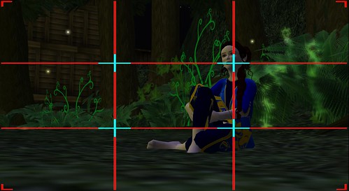
The Rule of Thirds, is the division of the frame into equal thirds vertically and horizontally. The intersection of the lines are considered focus of interests, and the lines themselves can help balance out the element of the shot.
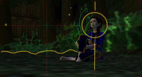
The focus of interest here is the face - which falls into the topright intersection. The body ( mainly head and spine ) falls on the right vertically third. and the ground lies along the bottom third.

The Final Shot -
more info on Rule of Thirds here
Dynamic Symmetry

Dynamic Symmetry is based on the Golden Section. Draw lines diagonally from each corner of the frame, then draw lines perpendicular to the first lines that go back to the opposite corners. Again the intersections of the lines are the hotspots of interest.
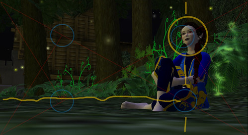
Again the focus of interest is the face, falling into the top right intersection. The body falls vertically between the two areas of interest, and the ground runs through the areas of interest on the bottom.

The Final Shot.
Some further info on Golden Section / Phi 1.618 here -
and quite a creepy video on Golden Mean here - http://www.youtube.com/watch?v=2zWivbG0RIo
With either principle of composition, it is important to keep things simple - particularly having only ONE focus of interest.
Personally I prefer the dynamic symmetry layout - which seems more visually exciting when applied to a HD video framing.
No comments:
Post a Comment